How to make
a call to action pop-up notification
Magic-WIDGET.COM
A call-to-action (CTA) pop-up widget is a graphical user interface (GUI) component that is designed to encourage a user to take a specific action, such as signing up for a newsletter, making a purchase, or downloading a file.
The CTA pop-up widget usually appears as a window or a dialogue box that overlays the content of a website or application. It may be triggered when the user performs a certain action, such as spending a certain amount of time on a page or scrolling to a specific point on the page. Alternatively, the CTA pop-up widget may appear when the user attempts to leave the page or close the application.
The content of the CTA pop-up widget typically includes a clear and compelling message, a brief description of the action that the user is being asked to take, and one or more buttons that allow the user to take that action. The CTA pop-up widget may also include additional information, such as the benefits of taking the desired action or social proof, such as customer reviews or testimonials.
CTA pop-up widgets are commonly used in digital marketing and e-commerce to drive conversions, encourage sign-ups, and promote other desired user behaviors. When used effectively, a well-designed CTA pop-up widget can help to improve conversion rates and drive more revenue for a business.
Below are some purposes for using a call to action (CTA) pop-up widget on your website:
- Increase conversions: A CTA pop-up widget can help increase conversions by directing visitors to take a specific action on your website, such as making a purchase or filling out a contact form.
- Promote special offers: You can use a CTA pop-up widget to promote special offers or discounts to visitors, encouraging them to take advantage of the limited-time opportunity.
- Grow your email list: A CTA pop-up widget can be used to encourage visitors to sign up for your email list by offering an incentive, such as a free ebook or discount code.
- Direct visitors to helpful resources: You can use a CTA pop-up widget to direct visitors to helpful resources, such as a blog post, tutorial video, or product demo.
- Encourage social media engagement: A CTA pop-up widget can be used to encourage visitors to follow your social media accounts or share your content on social media.
By using a CTA pop-up widget, you can create a clear and compelling call to action for visitors to take a specific action on your website. However, it’s important to use best practices to ensure that the pop-up widget is not intrusive and does not negatively impact the user experience on your website.
- Keep it simple: Keep the messaging on your CTA pop-up widget simple and concise. Use clear and easy-to-understand language that communicates the value of taking the action you’re asking visitors to take.
- Choose the right timing: Choose the right timing for your CTA pop-up widget. For example, you may want to show it after a visitor has been on your website for a certain amount of time or when they’re about to leave.
- Design for user experience: Design your CTA pop-up widget for a positive user experience. Use eye-catching graphics and colors that match your brand and make it easy for visitors to close the pop-up if they’re not interested.
- Offer an incentive: Offer an incentive for visitors to take the action you’re asking for. For example, you might offer a discount code or free download in exchange for signing up for your email list.
- Test and optimize: Test different versions of your CTA pop-up widget to see what resonates best with your audience. You can test different messaging, timing, and design elements to optimize your conversion rate.
By following these best practices, you can create a CTA pop-up widget that effectively encourages visitors to take a specific action on your website without negatively impacting the user experience.
Use the call to action pop-up widget to encourage users to go to the product page. Add an image to attract more attention to the notification. Highlight the benefits of your specific offer.
Create an Account or Sign In and Connect the Website
Find more information on connecting the website to the Magic Widget system here.
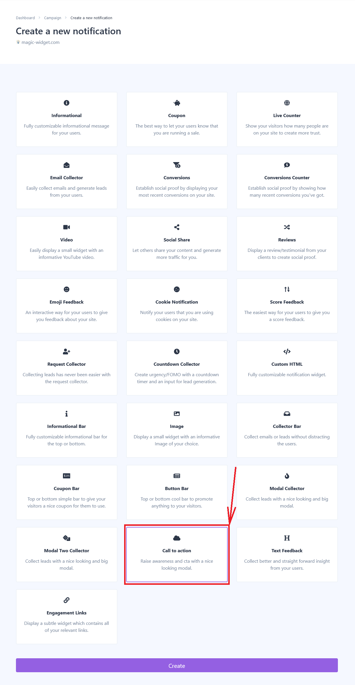
Select the Call to Action Type and Create the Notification

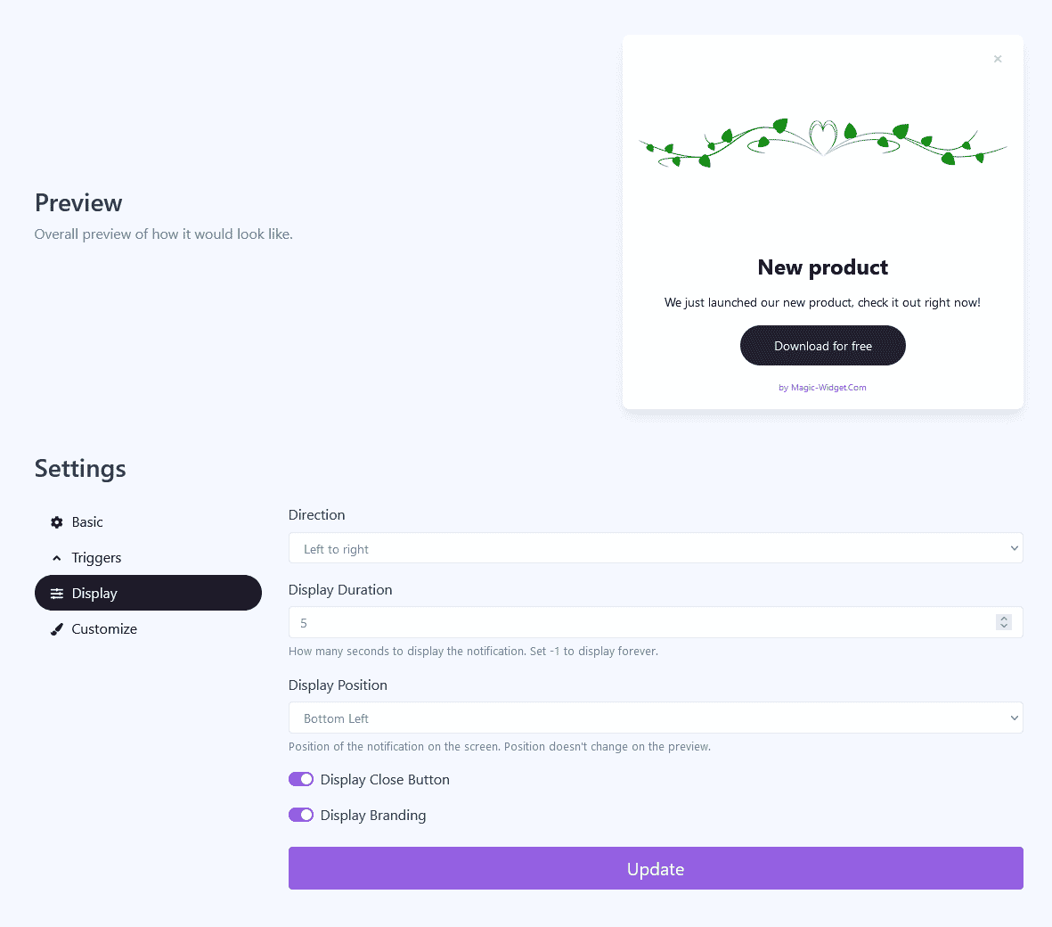
Below is the step-by-step guide on creating a call to action pop-up notification with Magic Widget tools, including all settings and design options.
Basic Settings

Triggers

Display Settings

Design Settings

Activate the Notification

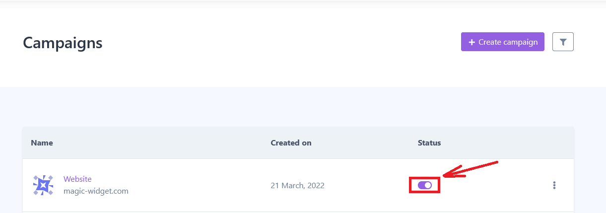
Activate the Campaign

