best practices for creating
the high converting pop-ups
Magic-WIDGET.COM
Here are some common best practices for creating high converting pop-ups:
- Keep it simple and clear: The message and purpose of your pop-up should be immediately clear to your website visitors. Use simple language, clear design, and avoid clutter or unnecessary elements.
- Use attention-grabbing headlines: The headline of your pop-up should be attention-grabbing and clear, conveying the value proposition or benefit to the visitor.
- Provide value: Provide a clear benefit or value proposition to the visitor in exchange for their attention and contact information. This could be a free resource, discount, or exclusive content.
- Use persuasive copy: Use persuasive language and copywriting techniques to entice visitors to take action, such as using urgency, scarcity, and social proof.
- Target specific segments: Use targeting options to show your pop-up only to specific segments of your audience, based on factors such as behavior, location, or device.
- Optimize for mobile: Ensure your pop-up is optimized for mobile devices, with clear and easy-to-use forms and buttons.
- A/B test: Conduct A/B testing to compare different variations of your pop-up design, messaging, and targeting to determine the most effective approach.
- Monitor performance: Monitor the performance of your pop-ups, including conversion rates and user feedback, and make adjustments as needed to improve effectiveness.
- Remember, the goal of a pop-up is to provide value to your visitors while achieving your business objectives. By following these best practices, you can create pop-ups that are effective, engaging, and provide a positive user experience.
According to the market survey, the average pop-up conversion is near 3%. This rate means how many users took some action from those who viewed the pop-up.
Following the provided best practices for creating the high converting pop-ups with Magic Widget, you will be able to increase the mentioned rate up to 10 percent or even more.
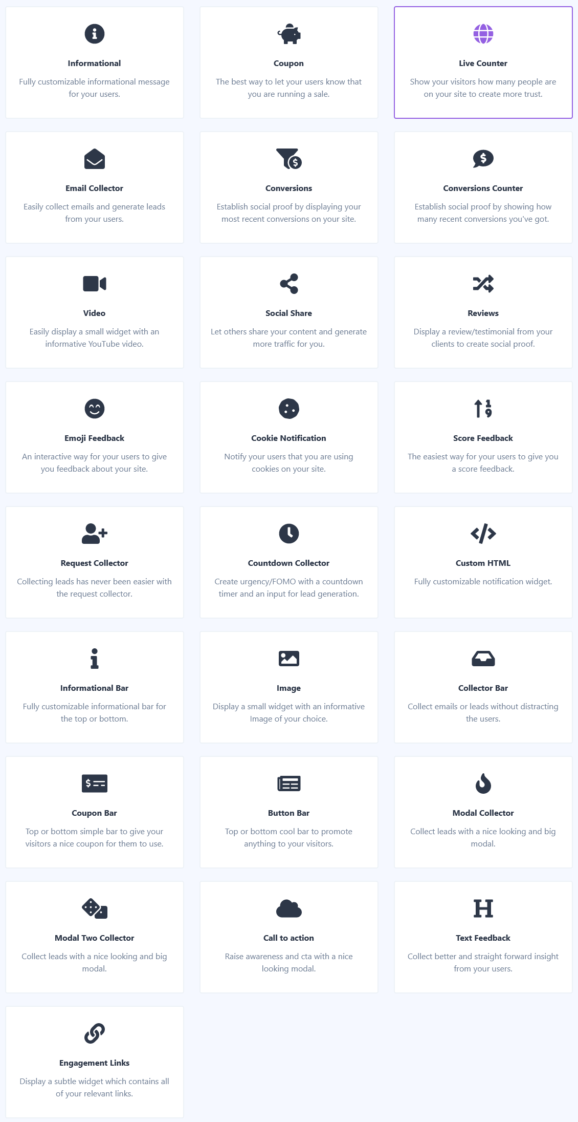
Select the right type of pop-up

Provide a valuable offer
Don't display pop-ups immediately when the page loaded
It has the sense to set up a delay for at least several seconds before the pop-ups appear to let the user meet the page content.
If a few pop-ups are used on the same page the first one performs over 30% better.
It is a good option to use the exit intent trigger to display notifications converting the leaving users into customers or subscribers.
Besides the exit intent and time delay, the Magic Widget Builder provides an opportunity to use another trigger and display notification after the user scrolled some percentage of the page, providing the content for the most interested visitors.
Make sure the pop-up complies with the style and context of the web page
Although it is required to use contrast colors, try to follow the same style of color palette and fonts you have on the web page.
Also, it is important to comply with the context. If you provide the discounts it is better to do this on the product page. Offering the subscription has the best performance on the blog posts and so on.
Such an approach can increase the pop-up conversion rate up to 35%.
Call to Action
Close button
Display on mobile and tablets
Test before publish
Track and analyze the statistical data

